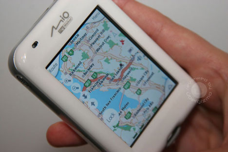
Slinky Mio H610 GPS gets put through its paces
You'll hear this one a lot: "If Apple made a GPS, it'd probably look like Mio's H610", but then Mio invite it upon themselves by designing a unit that would even make Jonathan Ive do a double-take. The slick white case, the absence of cluttered controls, the achingly sharp screen... it blows the capable but dowdy TomTom navigators out of the water (which they really ought not be in, as they're generally not waterproof).
Uber Gizmo have one of these lovelies in their dexterous little hands and have given it a gosh darned good reviewing. There's a photo gallery and a video and words and everything – it's like review Christmas has come early! They decide that while the hardware is great, the software could do with some tweaking – overly busy and cluttered icons get a mention, although they're also quick to point out that their unit isn't running the final software version. Generally, however, they're in love with it. Go give it a read and find out exactly why.
Mio H610 full review [Uber Gizmo]
