MeeGo Tablet UI hands-on [Video]
After a generally apathetic response to MeeGo's new tablet UI yesterday, we thought we should stop by the booth and check out the system for ourselves. Running on Atom-based hardware, the interface is undeniably less complex than what Google, Apple, HP or RIM are pushing with their respective platforms; check out the demo video after the cut.Video demo after the cut
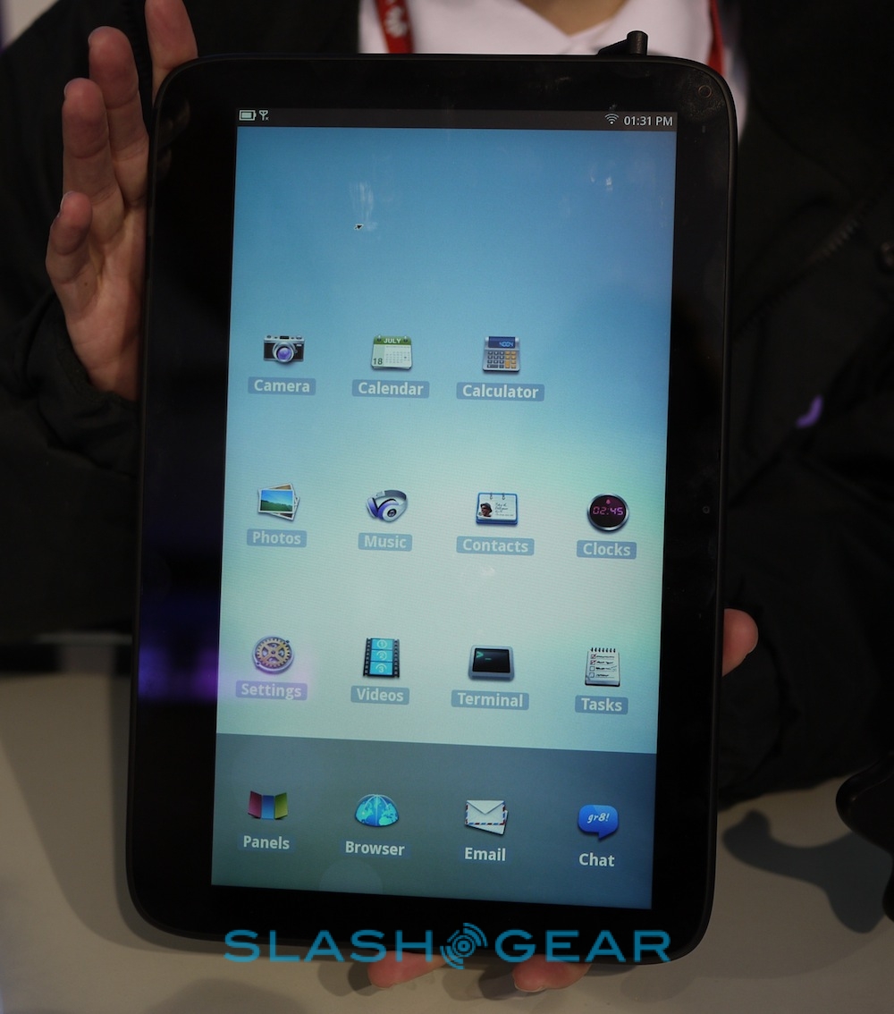
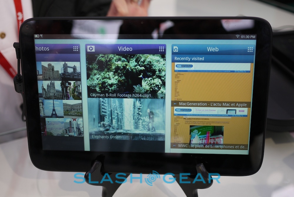
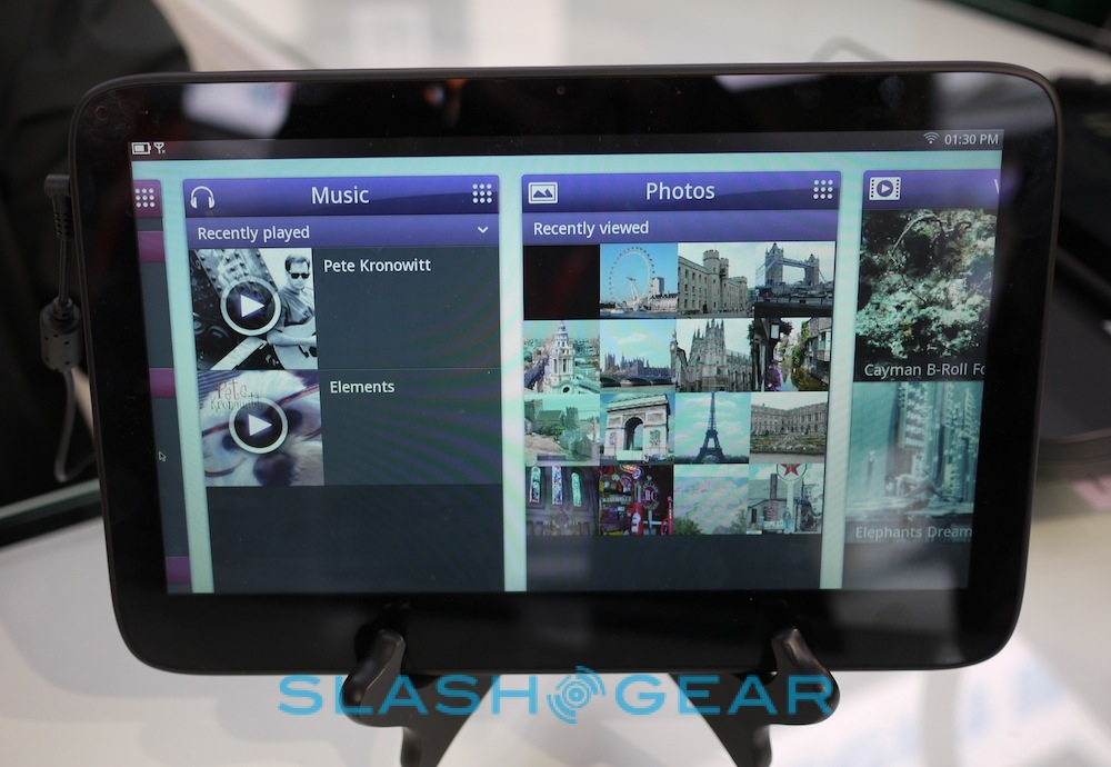
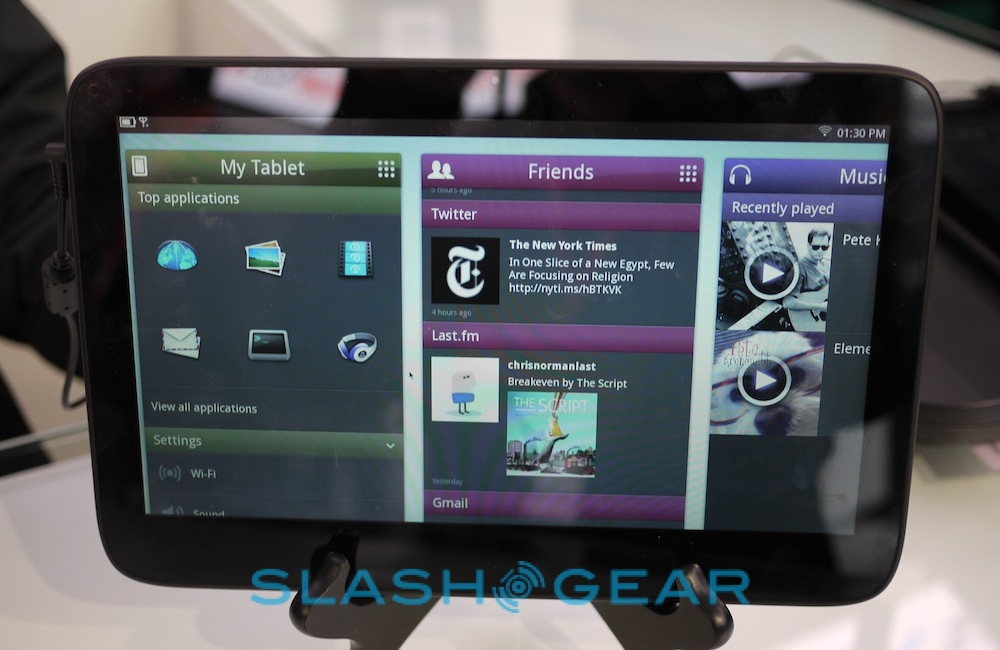
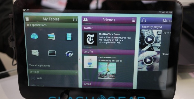
By default, it consists of six panes – My Tablet, Friends, Music, Photos, Video and Web – each of which can be scrolled between horizontally, reorganized and scrolled vertically to show more content. A further "View All Applications" layout – which is portrait, not landscape – looks remarkably like an early Android homescreen; the MeeGo reps we were talking to acted quite sheepish when we pointed that out.
Friends is the social networking side, pulling in updates from RSS feeds, social networks, email accounts like Gmail, Last.fm and other sources. Music, Photos and Video are self-explanatory – each opening up into a straightforward gallery of content – while Web lists your most recently visited sites first and then has bookmarks at the bottom. Downloads from the AppUp store can be found in the All Applications view.
MeeGo tablet UI demo:
[vms d362da0e3f4e70b878c1]
It works, in as much as it does exactly what the MeeGo team says it does (though multitouch hadn't been enabled on this particular demo unit), but it feels spartan in comparison to rival platforms. There's none of the sense of flexibility you get from iOS and Android: the overly-simplistic layout leaves the UI feeling more like that of a web-connected digital photo frame than a modern tablet.
Still, that could be a boon for those for whom other tablets intimidate with their complexity. Even an iPad can be a struggle for an entry-level user, and the simple swiping list system MeeGo offers might appeal. Whether MeeGo-adopting OEMs can cultivate that into a sizeable enough market, though, remains to be seen.