HP Radical Brand Redesign Proposal Revealed
HP's identity could certainly use a makeover and apparently the company has been actively looking into making some changes during the past few years. Moving Brands, a company specializing in branding, was hired back in 2008 to re-envision HP's image and has come up with something that was apparently too radical for HP's tastes. The branding company has recently made the project available for the public to take a look, including rendered images and videos.
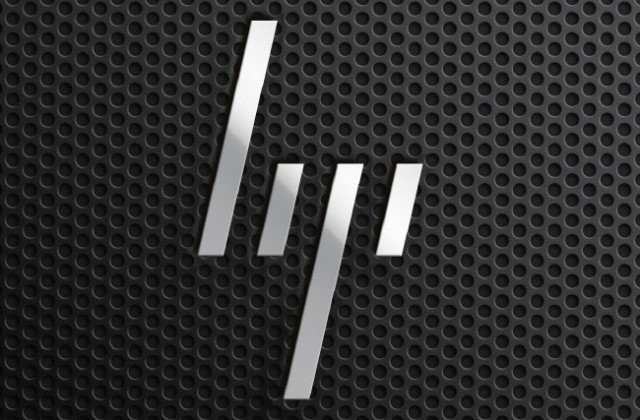
The proposed redesign features a very abstract and modern logo, where the rounded parts of the HP letters are removed, leaving behind simple slanted lines. These angled lines clearly remind us of the traditional HP logo while creating a new vibe of forward movement, adding an overall cool factor. However, such a major redesign like this one isn't likely in the horizon for now as HP is still struggling to find its direction after a confusing year.
HP has experienced some major changes this year, struggling unsuccessfully to launch a new WebOS ecosystem and hardware that ultimately got dumped abruptly and attempting to stabilize its leadership transitions with the replacement of Leo Apotheker by Meg Whitman as CEO. Whitman has already made some major decisions for the company, including not spinning off its personal systems group and making WebOS open source.
[via TechCrunch]