Google's big Android battery 'oops' and future Dark Modes
Today Google revealed a bit of information on how your smartphone spends its battery life. They did this at this week's Android Dev Summit, speaking to developers about what they can do in their apps to avoid consuming massive amounts of battery life. But this isn't just about that. This is about the biggest factor in battery consumption: screen brightness! And not only that, but screen color, too!
The information we're looking at today comes from Google during a presentation at the 2018 Android Dev Summit. That's different from Google I/O, for some reason – that's all about Android too, but also about Chrome, and other stuff. This was all about Android, this week, and the battery time that's most precious to all users. Mobile battery time, in smartphones, the devices most people use the most major amount of their time.
The first and most obvious piece of information Google shared was on screen brightness and power. This should be fairly obvious – more brightness means quicker power draw. They discovered that it's not always perfectly linear – but it's so close to linear that it might as well have been a straight line, one for one.

Next they shared some information on their studies which, as you'll see, weren't done with the most recent hardware we have available today. They did this study with the first Google Pixel. The differences between the first Pixel and the rest are irrelevant here. What's important is the difference between power draw on max brightness between normal mode and "Night Mode." Not every smartphone makes use of such a feature.

Google also studied color. The color shown on a display really, truly affects how much power is drawn from the battery of the phone. As you'll see in the chart here, each color has a different amount of draw on its device's battery.

The next chart shows the major differences between max brightness with a color like black (which has barely any power draw) and white (which has the most power draw of all.) As white uses all the display's various components to shine, it uses the most power.

Google's OOPS moment
Google admitted on stage today that they'd made a bit of a mistake. Not recently, but over the past several years. Since Google's Material Design initiative started, they'd been pushing the use of the color white, encouraging designers to use white as their primary color for all apps and interfaces.

ABOVE: Google's slide as they explained the situation with the display brightness and the color white. Because they'd been pushing white as a primary color for all Android (and other systems) software layouts.
Even now, as the event takes place, the "baseline Material color theme" as it exists at Google's official Material Design information site shows the following. Look at all that white.
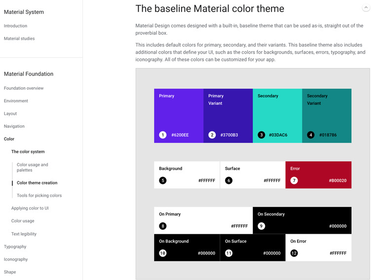
On Primary, Background, Surface, and On Error are all white. It's not that they shouldn't be – that just makes sense as a set of design defaults for all designers. But if we're aiming for ideal power drain, white shouldn't be here in its purest form, #FFFFFF ALL THE COLOR.
Dark Mode
Luckily, as Google revealed this week, the proverbial Dark Mode can make a big difference in how much power ALL THE APPS need in Android. Google will likely continue to release Dark Mode in their apps through the future – just so long as we keep needing to have to recharge the batteries in our phones.

I suppose they'll stop when they find that infinite renewable energy solution that allows our phones to stay powered up at all times. Keep your fingers crossed for that one – even though Dark Mode is better for your eyes, in the long run, too.