Google just completely revamped Google+
Google has just given their social network Google+ a major update, one they're calling "the new G+". This version of the social network is drastically simplified in both look and functionality, with new navigation centered on Collections and Communities. Playing to the social networks' strengths in this case means showcasing the communities that already exist and grow with speed – those that are bustling with activity and have visitors posting and commenting all day long. The home stream is redesigned as well.
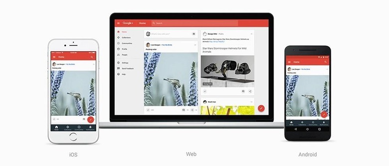
Google's update to Google+ includes a redesigned home stream that keeps main controls atop and below the moving river of content. Material Design cues can be seen throughout this complete aesthetic change-up, making the app more spectacularly simple, visually, and in turn making the app faster.

The new look for Google+ will be released simultaneously this afternoon on desktop machines (via the web), Android, and iOS devices – iPhones and iPads. The version you're seeing today is a preview, so you'll be able to switch to and fro between the new and the old if you do so wish.

"And since not every feature of Google+ has made its way into this new design," said Google's Luke Wroblewski, "for now, you can toggle back to the classic Google+ with one click in the bottom left-hand corner."

This new look will be appearing to Google+ users in the iOS and Android apps this afternoon – all you'll have to do is head to the web version of the social network and find the "Let's go" button. This button will be appearing for new users throughout the day.