Facebook overhauls "Like" button design with nixed thumbs-up
Facebook's thumbs-up icon has become near ubiquitous, with parody designs being used to denote the disliking of something, and the thumbs-up being used in many situations both within and outside of the social network to indicate favor towards something. That could slowly change in the future, with Facebook rolling out the first redesign of its "Like" button, sans thumb.
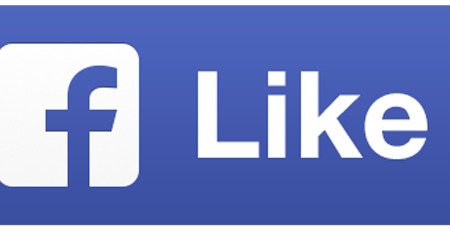
The redesign does away with the thumbs-up, replacing it instead with a small "f" Facebook icon, as well as the word "Like". The same applies for the "Share" buttons, all of which will show up next to articles, photos, and such around the Web. Depending on whether the smaller or larger version is used, the number of likes and shares will be displayed to the right or above the buttons.
Says the social network, the Like and Share buttons are viewed more than 22 billion times everyday, spanning 7.5 million websites. Collectively, they are responsible for a vast quantity of referral traffic, outpacing all other social networks combined, according to Facebook. The new design has already resulted in increased interactions, something anticipated to grow.
The new buttons are being rolled out over the next number of weeks, so those who aren't yet seeing them should be soon. Those who are presently using the original buttons will see the new ones upgrade in automatically. This new version is also optimized for higher-resolution screens, according to Facebook's product manager Peter Yang.
SOURCE: Mashable