Facebook has subtly redesigned its logo
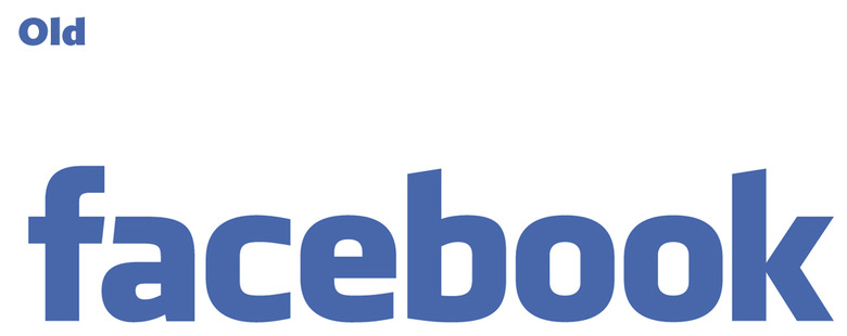
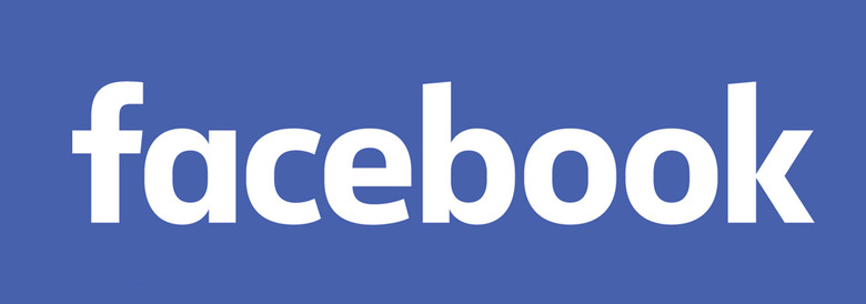
Companies update their logos on occasion — sometimes drastically, sometimes subtly. Facebook has quietly updated its own, and it has gone with the latter of the two extremes. The changes are subtle, and if you aren't the type to pay much attention to such things you might not have even noticed. Those who are familiar with the old Facebook logo will notice a couple slight differences, though, with the letter "a" being the biggest difference: it has been changed to reflect how most people write it rather than the traditional typist style. Other letters like the "k" hardly changed at all.
It is still the Facebook logo you've come to know and maybe love — the change was far less drastic than, for example, Netflix's own logo redesign. The letters are shorter and thinner, the "o" letters are a little more found, and the angles have been smoothed out every so slightly with an element of roundness.

UnderConsideration's Brand New spotted the changes first, and made the handy GIF you see above to highlight the differences between the two logos. The smaller "F" thumbnail doesn't appear to have changed any.
All in all it is a big change, but not a stark one, and given that the designs are similar in many ways it is a bit of a head-scratcher. Many users aren't likely to notice the changes, and those who do probably wont' find any compelling reason to prefer the new version over the old one, making it all seem rather pointless.
