Evernote For Android Gets Sleek Redesign
Evernote has pushed out a new design for its Android app, bringing it in line with Google's design guidelines for Lollipop by largely refining what it already offered. Not much has changed over the last design update, though Evernote says there's more to it than just the visual changes, and that "the thoughtful touches to these features" makes the overall Android note-taking experience better than before. Evernote went into details about the design change, talking about the motivation behind it and the best it has to offer users.
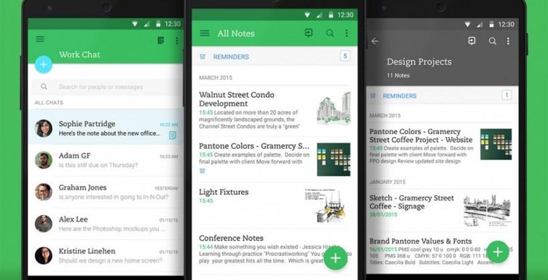
The new update features a flat design complemented by both shadows and depth that, says Evernote, make for cues that improve the usability. The company thinks of its latest design as being "independent levels" rather than a single cohesive screen, and joining those "levels" are animations that both offer guidance and make transitions between screens smooth.

Minimalist features mark the new design — says Evernote, the note editor is now "as sparse as it's ever been on Android". The clutter has been trimmed away to make for a clean, distraction-free interface. The collaborative features are included in all of this, now being offered in a "natural and learnable" manner.
Feedback from users was incorporated into this new design, as well, touching on some of the things users would like to see — this influenced some new button designs, for example. You can grab the newest update from the Google Play Store now.
SOURCE: Evernote Blog